
What are evaluation metrics?
Evaluation metrics are parameters that benchmark our machine learning algorithm. They are important in machine learning because they determine how well a model is performing and guide the decision-making process during model tuning. When we build a machine learning model, it’s not enough to simply train it and expect optimal results. We need to measure how effectively the model is making predictions and tune it. Evaluation metrics provide the right tools to do so.
Why Evaluation Metrics Are Key for Model Tuning
Evaluation metrics allow us to compare different model’s performance and fine-tune them. During the tuning phase, we change the hyperparameters or experiment with different algorithms. Without a clear performance metric, it’s impossible to judge which model is better. For instance, in a regression model, using metrics like Mean Absolute Error (MAE) or Root Mean Squared Error (RMSE) provides insight into how far off the predictions are from the actual values. By monitoring these metrics, we can adjust our model for better performance, like reducing error rates.
Choosing the right evaluation metrics is crucial because it directly impacts the model’s real-world performance. The correct metric aligns the model’s predictions with the actual goals, ensuring that the model adds value rather than misleading results. Suppose, in a classification problem, accuracy might seem like a good choice for evaluating model performance. However, in cases where the dataset is imbalanced (like fraud detection, where the majority of cases are non-fraud), accuracy can be misleading. In such cases, precision, recall, or F1-score will provide more meaningful insights into the model’s ability to detect the minority class (fraudulent transactions).
Example
Let’s consider a bank, with 1000 transactions per day. Out of those 990 transactions are valid and 10 transactions are fraud. Our job is to classify the transactions and we deployed an un-trained model, which will flag everything as valid.
Then we deployed a with 99% accuracy(correctly_classified/total = 990/1000). However, it isn’t fulfilling the purpose we built it for. For this particular use-case if we look at recall it is 0%(True positives/True positives+False Negatives).
Hence it is of utmost importance that we choose the right evaluation metrics for your machine learning use case. So, we trained the model to align well with the business goals. There is a pool of evaluation metrics available for use in your machine learning project. We can discuss a few of them and understand how to choose them.
They evaluation metrics can be broadly classified based on the type of the problem they serve:
- Regression Problem
- Classification Problem
- Binary/Multi class
- Balanced/Unbalanced
- Clustering Problem
- Ranking/Ranking Problem
Make the right choice!
We should make a perfect choice of evaluation metrics based on the type of problem we are working on. It also depends on our business goals or agenda that we need to satisfy.
Regression Problem Evaluation Metrics
The regression problem deals with continuous variables, and the metrics we choose for it should handle the same. Below are a few available options, with their formulas, and example use cases.
MAE(Mean Absolute Error)
Formula:
MAE is used when we want to measure the average magnitude of errors without considering their direction. It’s useful when all errors are equally important.
For example, forecasting sales revenue in retail, where over-predicting or under-predicting has the same business impact. It is not a suitable metric when dealing with data where large errors should be penalized more heavily, such as high-risk financial forecasting. It is also not suitable when the target variable varies greatly, where the error at one point is significant and insignificant after some point.
MSE(Mean Squared Error)
Formula:
MSE is valuable when larger errors need to be penalized more, as it squares the errors, making them grow faster. Also a better choice, as it is easier to optimize the loss.
Energy consumption prediction, where large errors in forecasting usage can cause substantial grid imbalances. Not suggested when outliers are present, as MSE tends to exaggerate their effect on the error.
RMSE(Root Mean Squared Error)
Formula:
RMSE is useful when you want an interpretable error value in the same units as the output. It’s sensitive to large errors like MSE.
For example, predicting housing prices in real estate, where large deviations from the true price can lead to costly mispricing. Should be avoided, in cases where you want to minimize the influence of outliers, like certain medical test results.
R-Squared
Formula:
R-squared shows how well the model explains the variability in the data. It’s useful in understanding model fit for regression.
For example, it is useful when evaluating how well GDP is predicted based on various economic factors in macroeconomics. Should not be used for non-linear models, as it assumes linearity in the relationships between variables.
Adjusted R-Squared
Formula:
Adjusted R-squared is an improvised version of R-Squared, and accounts for the number of predictors in the model and is useful when comparing same models with different numbers of variables.
An example use-case is in marketing, when analyzing the impact of multiple channels on sales to determine the best fit model. Not good when dealing with non-linear regression or non-regression-based tasks like clustering.
MAPE(Mean Absolute Percentage Error)
Formula:
MAPE is useful when relative errors matter, as it expresses error as a percentage of the true value. It overcomes weakness of MSE, where outliers can impact the loss.
It is useful in cases such as predicting stock prices, where relative changes are more important than absolute differences. Not a good option when actual values containing zero or are very close to zero, as it can lead to very large errors or undefined percentages.
Huber Loss
Formula:
Huber loss is a combination of MAE and MSE, used when you want to minimize the effect of outliers without ignoring them completely.
Autonomous driving systems predicting distances to objects. Outliers (like rare measurement errors) are handled more gracefully. Not suggested for simple, clean datasets where no outliers exist and MSE or MAE would suffice as it is not easily interpretable.
Classification Problem Evaluation Metrics
The evaluation metrics discussed above are not suitable for classification problems because they are non-continuous variables, and in some cases, there are also no numerical values associated with these values to quantify the difference between predicted and actual values. Hence the metrics discussed below are more suitable in case of classification problems.
Accuracy
Formula
We can use accuracy to measure how often my model is making correct predictions overall. It’s helpful when the dataset is balanced, meaning the classes are roughly equal in number. For instance, when predicting answers to MCQs in a quiz, we can check accuracy to get a general idea of the model’s performance.
Accuracy metric should be avoided if the dataset is highly imbalanced, then it can be misleading. For example, predicting that all emails are “not spam” might still give me a high accuracy(as spam mail will be less compared to not-spam), even though the model fails to detect actual spam emails.
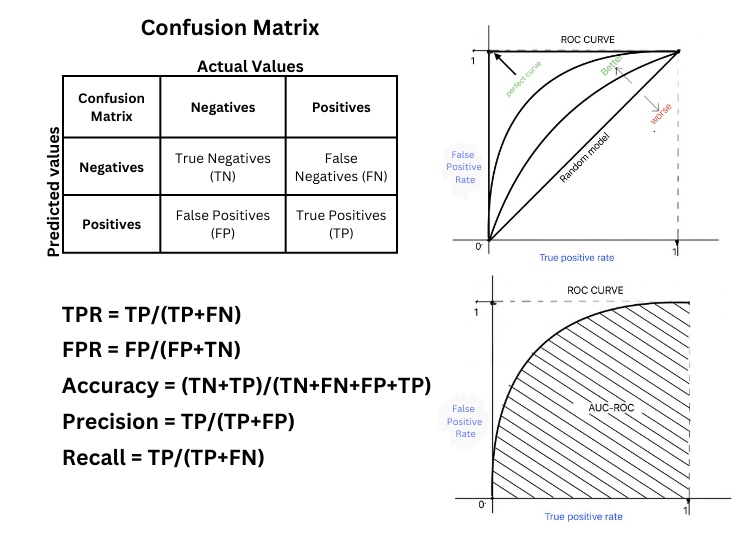
Confusion Matrix
The confusion matrix can be used to see the full breakdown of how the model classifies positive and negative instances. It’s a great tool for understanding the different types of errors a model makes, like false positives and false negatives. For instance, in an email spam classification system, the confusion matrix helps me visualize how many legitimate emails were incorrectly marked as spam (false positives) and how many spam emails were missed (false negatives).
The confusion matrix can be hard to interpret for multiclass classification without additional metrics like precision and recall for each class. Refer to the image after the ROC Curve to see how the confusion matrix exists.
Recall
Formula
Recall can be used when we want to ensure that our model catches as many positive instances as possible. For example, in a medical application for detecting a rare disease, recall helps me focus on how many actual cases of the disease my model identifies rather than not identifying negative cases, ensuring that I minimize the number of false negatives. This helps us penalize false negatives, and reach our business objective.
Recall alone might not be useful if false positives also have a high cost. If I detect too many irrelevant instances, I’ll need to balance recall with precision. If false positives are proving costly, then recall is not a good metric to be considered.
Precision
Fromula
We can rely on precision when we want to be sure that the positive predictions our model makes are correct. For instance, when flagging fraudulent transactions in banking, high precision ensures that most of the transactions I flagged as fraudulent are fraudulent, reducing false alarms.
A thin line between Recall and Precision. Recall optimizes the number of positives identified out of total positives, while precision optimizes the number of positives identified are positives.
If precision is high but recall is low, my model might miss many actual fraudulent transactions. I have to consider both precision and recall together to avoid overconfidence in my model.
F1-Score
Formula
We use the F1-score when we need to balance precision and recall, especially if our dataset is imbalanced. It’s a harmonic mean of both metrics, so if one is significantly lower than the other, the F1 score will reflect that. For example, in a cancer detection model, the F1-score ensures that my model is not missing too many positive cases while also maintaining a reasonable level of precision.
The F1 score doesn’t provide detailed insights into which specific metric (precision or recall) is underperforming. So, I prefer to examine both individually before relying solely on F1.
ROC – Receiver Operating Characteristic
When we have different hyperparameters possible, the ROC curve can be used to visualize the model’s performance across different threshold values. By plotting the true positive rate (recall) against the false positive rate, I get an idea of how well my model distinguishes between the positive and negative classes. For example, in a credit card fraud detection model, I look at the ROC curve to decide the optimal threshold for flagging a transaction as a fraud based on how sensitive I want the model to be.
For a perfect model where the true positive rate is 1, and the false positive rate is 0. The ROC Curve will be a perfect square. As the decision boundary changes the square gets trimmed and the area enclosed gets decreased.
The ROC curve might not be useful in highly imbalanced datasets because even a model that performs poorly for the minority class can have a high true positive rate.
AUC-ROC: Area Under the Curve of ROC
We can use AUC-ROC as a single value to summarize my ROC curve. If AUC is close to 1(Perfect square), my model has a good performance in distinguishing between the classes. We can often check AUC-ROC when comparing different models to quickly identify which one performs best overall. For instance, in a customer churn prediction model, a higher AUC-ROC means the model is better at identifying which customers are likely to leave.
If my problem requires focusing on just one part of the ROC curve (e.g., high recall or high precision), AUC-ROC might not give me the detailed view I need.
Log-Loss
Formula
Log-loss is used to penalize my model for incorrect predictions, especially when I’m predicting probabilities. It’s especially useful when we want the model to output well-calibrated probabilities instead of just a classification. For instance, in weather forecasting, log-loss helps me evaluate how confident the model is in predicting rain vs. no rain.
Log loss might be too sensitive in some cases where I care more about classification decisions than the predicted probabilities. For example, in spam detection, exact probabilities may not be as important as whether an email is classified correctly.
MCC – Matthews Correlation Coffecient
Formula
We use MCC when we need a balanced evaluation metric that handles both imbalanced datasets and classification errors well. It produces a score between -1 (completely wrong) and 1 (perfect classification), which makes it ideal for comparing models. For instance, in medical diagnostics, where both false positives and false negatives can be costly, MCC gives me a reliable assessment.
MCC might not be necessary when a simple metric like accuracy or F1-score provides sufficient insight. For example, in balanced binary classification, I might prefer simpler metrics.
Clustering Problem Evaluation Metrics
The clustering evaluation metrics discussed below give us diverse ways to evaluate how well our clustering algorithms perform, depending on whether one has ground truth labels or not, how many clusters we expect, and how separated we need those clusters to be.
Silhouette Score
Formula:
We can use the Silhouette Score to evaluate how well the clusters are separated. It ranges from -1 to 1, where a score closer to 1 indicates well-separated clusters. For example, when segmenting customer data into groups based on behaviour, one can rely on the Silhouette Score to assess whether the clusters are compact and well-distinguished.
If the cluster is not compact, then the a increases and the score becomes negative. If b>>a, then the score will be closer to 1, indicating good clustering.
Not a good metric, when clusters vary greatly in size or density, the Silhouette Score might not give an accurate measure of clustering quality. For example, in social network analysis, where clusters are naturally uneven, I may prefer other metrics like the Davies-Bouldin Index.
Davies-Bouldin Index
Formula:
Davies-Bouldin Index is used to measure the ratio of intra-cluster distance to inter-cluster distance. The lower the score, the better the clusters are. It’s helpful when we need to minimize within-cluster spread while maximizing the separation between clusters. For example, in image segmentation, where I group similar pixels, I ensure the clusters are distinct by using this metric.
Not suggested, in cases where we have very tight, small clusters and very large clusters together, the Davies-Bouldin Index might misrepresent cluster quality.
Dunn Index
Formula:
We can use the Dunn Index when we want to maximize the distance between clusters while minimizing the diameter within clusters. It’s useful for evaluating cluster compactness and separation simultaneously. For example, in bioinformatics, we can use it to evaluate clusters of genes or proteins, ensuring high separation between functional groups.
The Dunn Index might be too sensitive to noise or outliers, giving overly optimistic results in real-world datasets with many anomalies.
Adjusted Rand Index (ARI)
Formula:
I rely on the Adjusted Rand Index to compare the similarity between the clustering I produced and the known ground truth. This is especially useful when the true labels are available, such as in document classification or medical diagnosis. ARI accounts for chance, so it gives me a more reliable comparison than the standard Rand Index.
If no ground truth exists or the problem is unsupervised, ARI doesn’t apply, so I would use an intrinsic metric like the Silhouette Score instead.
Normalized Mutual Information (NMI)
Formula:
We can use NMI to measure the shared information between the predicted clusters and the actual labels. It’s normalized to handle varying cluster sizes, making it ideal for text clustering tasks, where I cluster documents into topics and compare them with known categories.
NMI doesn’t handle noise well, so if I expect noisy or overlapping clusters, other metrics like ARI or Silhouette might provide better insight.
Recommender/Ranking Problem Evaluation metrics
These evaluation metrics are useful when working on ranking problems, certain metrics give importance to the rank order and certain don’t. Be sure to check out and find relevant for your use case.
Precision at K (P@K)
Formula:
\[P@K = \frac{\text{Relevant Documents in Top K}}{K}\]
I use Precision at K to measure how many of the top K recommendations or predictions are relevant. It’s especially useful in recommendation systems, such as recommending products to customers on an e-commerce platform. If I recommend 10 products and 7 are relevant, P@10 would be 0.7.
Precision at K only considers relevance and ignores the order of the recommendations. For instance, if I’m building a search engine, the order in which relevant results are returned matters more, so I might prefer using NDCG or Mean Reciprocal Rank.
Note: Alternatively you can use Recall @ K, refer here
Mean Average Precision (MAP)
Formula:
I use MAP to evaluate ranking systems across multiple queries. For example, in an information retrieval system, I look at MAP to understand how well my search engine ranks relevant documents across many different user searches. It averages the precision scores at each relevant document, so it’s more informative than Precision at K alone.
MAP might not be suitable when I care more about the rank of the first relevant document or the overall ranking order. In those cases, I might rely on metrics like NDCG or MRR.
Normalized Discounted Cumulative Gain (NDCG)
Formula:
I use NDCG when I want to evaluate not just whether a recommendation is relevant but also its position in the ranking. For instance, in a movie recommendation system, if the most relevant movie is ranked higher, the NDCG score will reflect that. It’s a go-to metric for tasks like search engine optimization and ranking algorithms.
NDCG requires relevance scores for all items, which may not always be available or easy to determine in certain domains like binary classification (relevant/not relevant). In such cases, simpler metrics like Precision at K might suffice.
Hit Rate
Formula:
I use Hit Rate to measure how often my recommendation system provides at least one correct recommendation within the top N items. In an online retail recommendation system, a “hit” occurs if a user purchases one of the top-N recommended products. For example, if 80 out of 100 users find a relevant product in the top 10 recommendations, my Hit Rate @ 10 is 0.8.
Hit Rate doesn’t measure the ranking or number of the relevant items within the top N. Even if one relevant item appears in top 10, it’s still counted as a hit. I may use more detailed metrics like NDCG if ranking order/count of relevant items is important.
Mean Reciprocal Rank (MRR)
Formula:
I use MRR to measure how quickly I retrieve the first relevant result. It’s especially useful for tasks where users only care about the first relevant recommendation. For example, in a question-answering system, MRR tells me how well the system ranks the correct answer as the first result. A higher MRR indicates that users are likely to find relevant answers quickly.
MRR only looks at the rank of the first relevant result, so it doesn’t account for the overall ranking quality of other relevant items. If I care about ranking multiple relevant results, I’d opt for NDCG or MAP.
Quiz
Conclusion
These Evaluation metrics give me different perspectives on my model’s performance depending on the problem’s context, dataset, and goals. Selecting the right ones helps me ensure that the model aligns with business objectives and minimizes costly errors. Make sure to understand which works best for your use-case and use it, there are no hard and fast rules on what to use. But, if you have decided on using a metric, be ready to explain why.


One response to “Decoding Evaluation Metrics: Empower Your Project with the Best Fit”
[…] < previous […]